There are a lot of new web technologies emerging at the moment which really feel like we're entering a new era. Over the last decade, the likes of HTML5, ES6+, flexbox etc. have brought the web, and the technologies on which it is built, very much into the modern-day. Accessibility, responsiveness and flexibility have become standards, instead of the nice-to-have pipedreams they were when I first built a website. Still, a lot of the new features and developments have been addressing limitations of what the web was back in the early noughties.
Right now, then, is a little different. There are still plenty of problems with how the web operates, limitations to its functionality and misuses of its resources, but with a little time and effort a website can become everything it was ever designed to be, and much more. The next round of technological implementation, then, is redesigning the way the web works. Do you need an active internet connection to be 'online? Not any more. Want a website to do more than simply house and interlink static text? That's getting pretty common.
Despite these huge leaps forward in terms of functionality, one element of those old, dark days has remained missing. Right when I started to learn HTML the standard approach was to mimic page setting from magazines by using <table> elements. That practice died a deserved death, but ever since the web has been slightly restricted in how it can display information in a dynamic, yet rigidly structured, manner. There have been improvements, such as display: table, flexbox and semantically clearer HTML (<section>, <article>, <aside> etc.), but ultimately none have met the ease of application of a table layout.
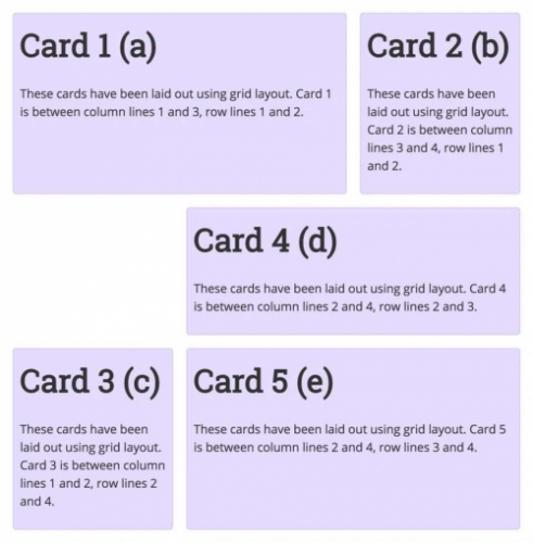
Hopefully that's about to change, thanks to CSS Grid. It's a technology I've heard bits and bobs about for some time, but I'll admit it hasn't excited me like service workers or PWAs have. Thanks to (yet another) great article from A List Apart, I'm now firmly on board the Grid train and willing it to go faster, and faster, and faster. Honestly, I love the whole concept, but for me one of the most exciting aspects is the quick prototyping available through template-areas. For a full breakdown, read the article, but the "aha!" moment for me was seeing how this:
.cards {
	display: grid;
	grid-template-columns: 1fr 1fr 1fr;
	grid-gap: 20px;
	grid-template-areas:
		"a a b"
		". d d"
		"c e e";
}
Is automatically translated into this:

That's not just replicating all the functionality of the table-based layouts of yesteryear, it's taking the best part of it, the flexible rigidity, and removing all the irritating parts, leaving just the essence. It's wonderfully simple yet extremely powerful and has clearly been thought through to an obscene degree. The fact that even blank cells are inherently catered for, rather than having to just set a blank <div> or similar, is just fantastic. Vendor/browser support will be the next big hurdle, but by the sounds of things that's coming along extremely well. Give it a year and CSS Grid looks like it could well be the new standard approach.
