Explore My Notes

Accessible data visualisations with D3.js | Sarah L. Fossheim

A comprehensive guide to ensuring simple charts and graphs are accessible. Focuses on D3, but most of the tips and suggestions can easily be ported to any visual UI. These include:

  • Ensuring graph regions (e.g. pie slices, bars, lines) use enough colour contrast and colours that are distinct enough regardless of colour vision needs (i.e. colour blindness);
  • Using textures and patterns within graph regions where colours are not distinct enough;
  • Inclusion of a clear legend;
  • Use of a title and summary description;
  • Visible data values and axes titles;
  • Use of "ticks" for the y-axis so that it's easier to compare bars.

The final outcome looks like this:
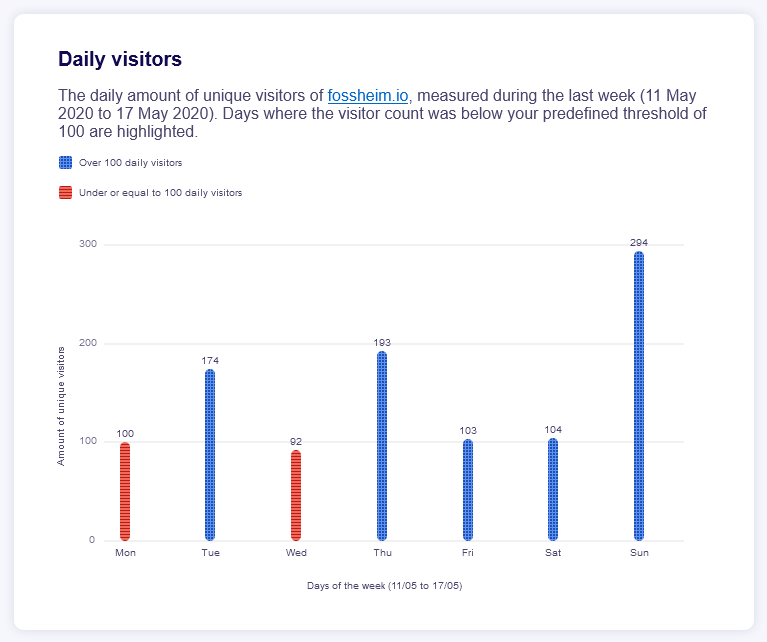
A bar chart showing daily visitor numbers to Sarah's website. There is a headline and description at the top, detailing the period the data covers (the first half of 2020) and stating that days which had less than 100 visitors are highlighted. Below this is a legend with two entries: blue with a checked pattern for over 100 daily visitors; red with a lined pattern for under 100 visitors. The chart itself has labelled x and y axes; the y shows amount of visitors, with marked lines at 100, 200, and 300. The x-axis shows the days of the week, from Monday to Sunday in order. Each bar on the chart is colour-coded as per the legend and shows a data value at the top. These are: Monday, 100; Tuesday, 174; Wednesday, 92; Thursday, 193; Friday, 103; Saturday, 104; Sunday, 294.
It's frankly impressive how many people read Sarah's blog on Sundays! Must get that Sunday morning, breakfast-in-bed, RSS crowd 😂

On using texture or patterns as well as colours to distinguish graph regions:

If you want to be extra safe, or can't avoid using colors that meet the guidelines when it comes to colorblindness, you can also add patterns to your graphs. Make sure to not overdo it and go for calm patterns, otherwise the graph might become too busy on the eyes as well.

On where to best position legend elements:

Screen readers read the DOM elements in the order that they appear in your code. So in my example, I added the code for the legend on top, before the code for the x-axis

Accessibility, data visualisations, & the Norwegian 2023 election | Sarah L. Fossheim

An excellent write-up of where election maps, result graphs, and other common data visualisations used in election reporting most commonly fall down. Missing descriptive text, unassociated labels, inaccessible toggles and interactive elements. Unfortunately doesn't go into much detail on solutions, but interesting screen reader recordings highlight some of the main roadblocks.

On the inherent difficulties with working with data on the web:

Data visualizations typically are inaccessible by default. If we don't actively curate accessibility of our charts, we will end up with visualizations that are varying levels of inaccessible.

Accessible D3 donut charts | A11y With Lindsey

A solid tutorial on making an accessible donut chart with D3. A couple of options are discussed, along with the pros/cons of each. I personally prefer the first option, where the labels and data are intrinsically tied together.

On creating accessible tooltips that can be accessed by mouse and keyboard events:

To make tooltips accessible, we have to do a few things:

  1. Add a tabindex="0" to all the arc paths so that we can tab to it.
  2. Add an aria-describedby to each selected path with a unique value
  3. Add an id to the tooltip that matched the aria-describedby value. Because each id must be unique, we have to create multiple tooltips.
  4. Make sure that we add not only mouse events, but focus and blur events.

On ways to remove the redundant ARIA roles in SVGs, which are acting more like Canvas elements:

I learned through manual testing is that every single path element (the arcs) had a role of Image. And it announces on a screenreader. As a result, I’m going to put a role="presentation" on each path.

Accessible chart & data library | High Charts

Easily the most comprehensive and impressive charting and data visualisation library I've come across. Graphs and charts are keyboard accessible, well-labelled, meaningfully marked up, with colour options that help ensure contrast levels and much more. Heck, there are options for a user to generate a data table (where appropriate) and it just appears below the graph, with full HTML semantics. The only shame here is the cost, but you absolutely get what you're paying for 👏

As an aside, High Charts were recommended after some quick accessibility testing of other popular React options (the following conclusions are based on examples from each respective tool's demo page, assumed to be "as good as it gets":

  • Apex Charts: Nice visuals, good colour and texture options, and legend text is at least targetable, but relationships between values and labels are missing, popovers/tooltips are completely inaccessible, no keyboard support, and data values which are not visible cannot be uncovered by assistive tech. Verdict: meh.
  • Chart.js: Charts are surfaced as "clickable images" with more "clickable images" nested within. Keyboard support is patchy and buggy (I could jump around some graphs, but would get stuck at times). Data and labels are not paired. In fairness, the official recommendation here is that you add your own accessibility onto the Canvas element, but that's a suboptimal hack at best. Verdict: poor.
  • Google Charts (specifically the react-google-charts package): Legend is navigable with AT, but for some reason identifies as a task list. No real keyboard support. Text labels are accessible, but not paired to data meaningfully; any data points without visible labels cannot have their values surfaced, as tooltips are inaccessible. Charts have titles and at least some capability to provide accessible colour choices. Relatively well marked up and easy to skip around using AT, though (again) some values are simply impossible to get to without a mouse and visual browsing. Verdict: average but still inaccessible.
  • Nivo: In my opinion, the best looking. Excellent colour and texture options. Some nice accessibility affordances. Data is still not adequately associated with labels, though these are at least all accessible as text nodes. Unfortunately, the result is gibberish without visual guidance – strings of labels, legends, data values all given in blocks with no additional context. Verdict: better but still inaccessible.

Why not "simply" provide a text alternative? Make the chart invisible to AT using ARIA and stick a label on the wrapping element? That's definitely an improvement over the examples given, and at a pinch (if you're stuck with any of the above libraries) would be my suggestion. I also think – if done well – that this would meet WCAG SC 1.1.1 requirements. But if the graph accepts user control (which it likely should, if you are relying on popovers or similar techniques) then I don't think this goes far enough, and full keyboard control, contextual labelling, etc. would be needed as well.

We're still not innovating with AI-generated UI | Heather Buchel

With the recent announcement of an AI-UI tool from the folks at Vercel, there's been a lot of discussion about claims around "production-ready code" that is actually riddled with bugs, lacks semantics, and fails to meet even basic accessibility and UX criteria. Heather has written some solid thoughts around how not only is this not as innovative or new as is being touted, but that we're doomed to keep making these mistakes until actual UI experts are involved, and UI requirements like accessibility are baked in from the ground up:

No tool that asserts you can build production-grade UI code from their AI is innovative if it's not driven by accessibility. It's also not production-grade if the code it generates is inaccessible. That is the short and sweet of it.

On the reality of (and best application for) these tools, POCs and design/engineering discussions:

In the end, all we've built is a really high fidelity mockup of what the UI might look like.

Track design system use & adoption | Luro

A new tool that allows an organisation to check how, where, and why components are being used across shared codebases, and gain insights into their usage and performance.

Particularly important for determining how design system adoption is going and therefore where potential pain points might be. It also integrates with Storybook and other embeddable component libraries; Figma and other design tools; and runs industry-standard analytics on your sites at a component and page level (Lighthouse etc.). The result is a dashboard of key information, analytics, and documentation on every component and composed architecture, which sounds incredibly powerful and pretty darn cool.

📆 19 Sep 2023  | 🔗

  • Nuts & Bolts
  • Luro
  • design system
  • Figma
  • Storybook
  • documentation
  • analytics
  • Lighthouse 

Echoed whisper | Eric Meyer

Analysis of working with Whisper, an AI-driven tool for audio transcriptions; contains some useful information on caption accessibility and guidelines.

On optimal caption lengths:

The BBC recommends line lengths at or below 37 characters, and Netflix suggests a limit of 42 characters, with actual hard limits for a few languages.

Core web vitals & SEO | Harry Roberts

A solid overview of the impact that Core Web Vitals, PageSpeed, Lighthouse, and other metrics actually play in terms of a website's Google Page Rank.

On the actual relevance of Lighthouse scores (not as much as you'd think):

Google takes URL-level Core Web Vitals data from CrUX into account when deciding where to rank you in a search results page. They do not use Lighthouse or PageSpeed Insights scores.

On the aspects that Google does care about:

To get a ranking boost, you need to pass all relevant Core Web Vitals and everything else in the Page Experience report.
This means your rankings are reliant on your performance in Chrome, even if the majority of your customers are in non-Chrome browsers.

On why Google searches on mobile often return different results to desktop:

This means that your placement on each device type is based on your performance on each device type.

On the impact of SPA architecture (yes, it is still an issue):

If you’re a Single-Page Application (SPA), you’re out of luck. While Google have made adjustments to not overly penalise you, your SPA is never really going to make much of a positive impact where Core Web Vitals are concerned.
Therefore, optimise every SPA page for a first-time visitor.

📆 18 Sep 2023  | 🔗

  • Frontend
  • SPA
  • page speed
  • SEO
  • core web vitals
  • Lighthouse
  • Google 

The curious disappearance of the Carolina parakeet | Mental Floss

A look into the life – and death – of one of the more infamous recent extinctions: the Carolina parakeet (which, turns out, is not a parakeet at all, but a small parrot). I hadn't realised how successful the species had been pre-European agriculture arriving in the US, nor how rapid and unexplained its extinction was; unlike the similarly fated passenger pigeon, there doesn't seem to have been any specific attempt at eradication, and whilst the pet trade and the market for bird feathers likely played a part, there's no clear reason why the last populations in Florida disappeared so quickly.

On the timeline of extinction:

The last official sighting of a wild Carolina parakeet was in 1920, though unconfirmed report of birds in southern Florida and along the Santee River in South Carolina trickled in until the 1940s. The species was officially declared extinct in 1939.

On the original range of the bird; I had no idea it was this common:

The wild birds were a common sight in America’s fields and forests when the first European colonizers arrived, inhabiting a sizeable swath of the eastern United States, from the Midwest to the Atlantic Coast.

On how they didn't adapt well to guns:

A flock of the birds could decimate an apple orchard or cornfield; landowners often shot them when they descended on crops. And because the sociable parakeets typically stopped to mourn fallen members of their flock, they were an easy target for gun-wielding agriculturalists.

On the results of genetic studies done recently to determine if the population was more fragile than expected (it wasn't):

They found no genetic indication of inbreeding and few genomic signs that the species was destined for extinction.

On a recent theory that there were two species/sub-species, the western-most having gone extinct first, which may help explain some of the rapidity of the decline:

... there may have been two subspecies of the bird—one found in the Midwest, with a range that extended south to Texas and Louisiana, and an Eastern subspecies, with a range that extended from Florida to Virginia.

On de-extinction and the Long Now's involvement:

The Long Now Foundation's Revive & Restore project is working to restore the passenger pigeon, a species that disappeared just a couple decades before the Carolina parakeet.

📆 15 Sep 2023  | 🔗

  • Natural World
  • de-extinction
  • Carolina parakeet
  • passenger pigeon
  • Long Now Foundation
  • extinct 

Bookmarklet for responsive image linting | RespImageLint

Not overly tested, but covers a lot of the common gotchas around building responsive images for the web, and quickly identifies areas for improvement. Definitely feels like something that could be built into a CI/CD tool as well.

📆 15 Sep 2023  | 🔗

  • HTML & CSS
  • responsive design
  • responsive image
  • bookmarklet 

Visions of an alternate, slightly more habitable Mars | T. K. Sigvin

A remarkably complex and detailed spec-bio project, with a focus on an alternative history where early 20th century ideas about the ecosystems of Mars turned out to be much more accurate than in our version of events. But it's not just a chronicle of the biosphere of the red plant; Har Deshur dives into the ecology, biogeography, evolutionary history, and the cultural impact on humanity, whilst somehow also finding time to consider other alt-history options, such as life on Venus, the satellites of Jupiter, and the discovery of the mystery inner planet Vulcan that had been speculated (including how it stayed hidden).

I've barely scratched the surface of this intriguing project, and am interested to see where it goes next.

Using data-attributes for style variations | Stuff & Nonsense

An interesting approach to using data attributes to drive CSS utility classes. I'm not sure I like the overly granular control (it feels like it falls into the same category as Tailwind, but now with even more syntax and boilerplate) but I always enjoy Andy's takes on Grid structures and this is certainly a novel approach to that.

On BEM and why more modern approaches like CUBE are advantageous:

But, I’ve come to realise that BEM reduces instead of increases clarity and doesn’t help separate default styles from variations in the way that data attribute do.

Made By Me, But Made Possible By:

CMS:

Build: Gatsby

Deployment: GitHub

Hosting: Netlify

Connect With Me:

Twitter Twitter

Instagram Instragram

500px 500px

GitHub GitHub

Keep Up To Date:

All Posts RSS feed.

Articles RSS feed.

Journal RSS feed.

Notes RSS feed.