Explore My Notes

Hard to break | adactio

There's an idea at the core of Jeremy's thoughts here which struck a never, one that is best summed up in two quotes, one from Jeremy and another he quotes from Jamais Cascio (here given with Jamais first, Jeremy second):

When something is brittle, it’s susceptible to sudden and catastrophic failure.
It’s not that brittle sites don’t work. They work just fine …until they don’t.

I agree that brittleness is often a result of how things look fine. Jeremy makes the point that we have a "natural bias towards what's visible" and that's true. When the breaking points of our sites are invisible – because we're using fast connections, we're close to the server, we're operating on a desktop with a good screen, we're using a mouse to navigate – the site looks robust. But robust is not the same as "hard to break". It looks strong, but it may just be brittle.

Indieweb privacy challenges | Sebastian Greger

The IndieWeb was designed to be a better option for privacy, users, content authorship, and the open web. I think it largely meets those goals, but Sebastian has put together some excellent points on why it may fail on the privacy front at times:

  • Backfilling from silos can distort or misrepresent meaning. In other words, a "like" on Twitter may not be the same as a favourite or "like" on the IndieWeb. Nomenclature changes and people use these features for different purposes, for example for bookmarking posts;
  • Backfilling also adds unintended legitimacy to simple, spur-of-the-moment user interactions. Liking something on Twitter is considered fairly ephemeral by many: the author of the tweet will see I "liked" it, I will have a record, people can find that "like" if they dig deep enough etc. But backfilling onto a blog post means saving a person's digital identity – their profile photo, name, URL, details etc. – as well as their words to a more permanent store. Most importantly, you're doing so without asking their permission.
  • Relatedly, you're also not gaining permission to duplicate their content on your website. A reply that is backfilled is effectively stolen without authorial consent.

Sebastian has gone to lengths to solve these problems, anonymising his backfeed and generating pixelated avatars instead of displaying faces for any interactions that could be considered unintentional.

Example of anonymised feed with standard social sharing buttons and aggregated likes, favourites, and replies beneath. User photos have been pixelated and names removed.
I do think the idea of anonymising profile photos is pretty unique and looks great. I'd be interested to know if this method was random or if an image always output the same; the latter would be quite cool, but definitely has privacy concerns attached.

However, with the implementation of GDPR it seems that even that level of implementation may no longer fit privacy definitions. Whilst I would argue that many companies have since agreed that "public domain === consent" (that's certainly what I have been advised by multiple companies and legal firms), the right to delete is still a very valid point. As is the fact that – legal or not – you are copying someone's content and placing it somewhere else, without explicit consent. I have my own mixed and muddied views on that topic, but it is one that worries me.

Interestingly, it would seem that simply pulling total likes etc. from a silo would be fine and that makes sense. I see those interaction counts as ultimately the author's data, not each individual's who contributed, so only the silo would have a claim to stop you. Personally, that feels less creepy anyway, but it does lose the community feeling. Perhaps some kind of authorisation token within a person's own website (think IndieAuth) could be used to set your own privacy level to "always allow sharing", "never", or "only in X, Y, Z circumstances". As long as it was standardised it could work, though it would mean a separate fetch for each item in the backfeed (at a minimum, probably two: one to the silo profile, the second to the linked indie website).

Sass and clamp | adactio

Jeremy has been updating The Session to use variable font sizes with the new CSS clamp() property. He offers some interesting ideas on how best to do that:

:root {
    font-size: clamp(1rem, 0.5rem + 0.666vw, 1.5rem);
}

He also notes that in order to do this, he needed to remove Sass from the site. I find that interesting. Sass still appears to be a common prerequisite for frontend jobs, but I've never really understood why new projects would use it. When I returned to the frontend world a couple of years ago, I'd missed the Sass train. By the time I got around to thinking about learning it, I wanted to know what problem it solved. I came to the same conclusion then as Jeremy has done now, which is that all the solutions Sass provides are pretty much native to CSS these days.

Between CSS variables, customer properties, and calc() a lot of the benefit of Sass is now a burden. There are still two big bonuses: multiple files and nesting. I do wish CSS had a native nesting capability, but for the most part when I review Sass code it gives me a headache. DRY is great, but not at the expense of readability, which I fear it often ends up becoming with deep nesting.

As for multiple files, I guess I moved straight into the framework world on return. It's one of the things I love about CSS modules in React, that it lets me colocate my styles with my components from a dev perspective. In many ways, I prefer this to the .scss model.

I still have to work with Sass and imagine that isn't going to change; it's integral to a lot of tech stacks. But it's nice to see that I've potentially skipped needing to embrace it fully.

It feels like something similar has happened with tools like Sass. Sass was the hare. CSS is the tortoise. Sass blazed the trail, but now native CSS can achieve much the same result.

Figure it out | A List Apart

Colour is tricky, as discussed in this chapter of Figure it Out: Getting from Information to Understanding.

  • Western cultures have seven colours in the rainbow (ROYGBIV) because that's what Isaac Newton decided, based (of all things) on the Western musical scale. Seven notes, seven colours. That could explain why I (and many others) have no idea which part is "indigo".
  • Languages may have thousands of words or phrases for specific colours, but in general cultures tend to settle on < 20 for common use (normally around 10). That means different cultures perceive – linguistically at least – different colours with different words.
  • Russia, for example, has specific words for light blue and dark blue; they are two distinct colours. Early-modern Japanese (prior to extensive Western influence) grouped greens and blues together as one colour. The Berinmo people of Papua New Guinea see "yellow" as two distinct colours, nol and wor.
  • However, it does seem that colours follow a pattern of recognition within languages. First come words for dark and light (sometimes evolving in black and white over time); then red, followed (often quite a bit later) by either yellow or green. The last colour seems to always be blue. Again, there are exceptions, but in general this trend is observable around the world in linguistic archaeology.
While we’re keen to seek out human universals, color has proven to be something that does not have consistent meaning across cultures, or even within a culture group... The meanings we point to—blue as a safe, corporate color, for example—are highly generalized assumptions, highly contextual, and mostly learned associations.

The article continues by reviewing some of the impacts colour choices can have, though interestingly one of them didn't work for me. This graph is used to show that saturation can cause information bias; the chart on the left uses colours of uneven saturation levels, the one on the right has been "balanced" for saturation:

Two pie charts with identical segments, but one has been balanced for saturation by using different colours.
I wonder how many other people find the results of this experiment topsy-turvy...

The article claims that this causes the one on the left to become misleading, drawing your attention specifically to the orange segment and making it "pop". Weirdly, the opposite is the case for me. The left chart is very evenly balanced to my eyes and lets me take in the whole pattern very easily. The chart on the right I find very distracting, immediately being drawn to the red and purple and actively perceiving those segments as larger than they clearly are on the left-hand chart. The article argues that you should avoid the left chart as it is "unevenly perceived". Unfortunately, it seems like the right chart hits those same issues for me, so perhaps the lesson is that you're damned if you do, damned if you don't?

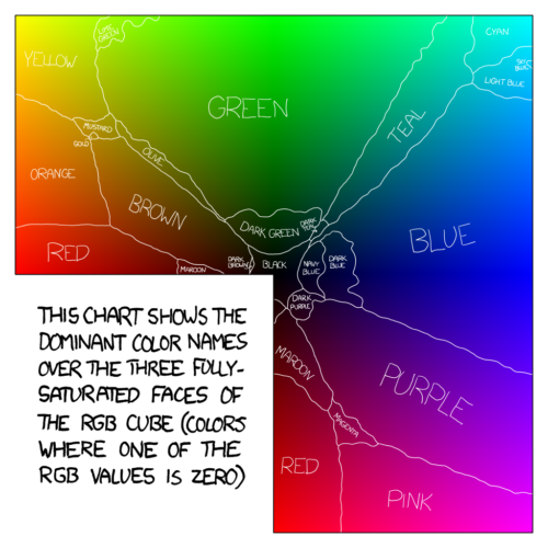
On a lighter note, they also reference this excellent breakdown of colour language in English by XKCD:

Colour map with English names drawn over the regions most likely to use that term, showing very uneven distribution and highly wavy boundaries.
I'd love to know who actually refers to a colour as "dark teal"? And where is "violet"?

Leaky roofs | Seth Godin

Expectations can be all the difference. Getting wet whilst outside? Understandable. Getting wet whilst inside, though?

Promising us a roof and then breaking that promise might be worse than no roof at all.

The miracle sudoku | Cracking the Cryptic

Attempting to solve a sudoku with only two clues and some abnormal rules turns into a joyous, strangely tense thrill ride.

Marxian alienation and web development | Heydon Works

Some interesting thoughts from Heydon on burnout, why it's a positive thing that we're talking about it more, and what a major root cause is for many people:

Burnout is what Marx called alienation. It's when a worker becomes estranged from their work. It sounds like a big, grand thing, but it happens every day, in small ways. As a web designer or developer burnout comes calling when you try to do good work, but you're not allowed.

Thinking in React hooks | Amelia Wattenberger

I'm not going to lie, some of Amelia's breakdown of why hooks > class components went over my head, but the reasoning is solid (plus, preaching to the converted 😉). Even better, though, is that she shares a number of open-source hooks you can use, including ones for synchronising URL hashes and setting/updating cookies. Useful.

📆 03 Jun 2020  | 🔗

  • JavaScript
  • React hook
  • React
  • component
  • class
  • function
  • example
  • guide
  • URL
  • hash
  • cookies 

It's plant, it's animal, it's bitroph | Planet Furaha

The idea of an animal that can derive all or some of its energy needs from the sun is one that sci-fi authors have often touched on. Gert has proposed the nomenclature "bitroph" for such a creature, which I like. He also points out that certain sea slugs are known that "steal" chloroplasts from ingested algae and continue to use them as a sort of battery; they aren't necessary for survival, but help during lean times. Personally, I've always considered the way cold-blooded animals bask in the sun a form of photosynthesis and saw the skeletal adaptations of creates like Dimetrodon (such as sails and large fins) as potentially analogous to bitrophic behaviour.

Gert has also modelled a rough estimate "leaf" size for a mammalian-type metabolic rate. For an animal the size of a bandicoot, it would need to be a circle with a 40cm diameter. Obviously that would look a little ridiculous (and be extremely vulnerable to attack) but honestly it's well within the bounds of reality, which is a pleasant surprise. As he points out, the surface area would be reduced for less energy-intensive body plans, such as crustaceans, as well; plus, having large foldable flaps of photosynthetic skin isn't exactly a stretch (pun intended) when you consider bat and pterosaur wings. Interesting indeed.

Update 15/06/20: Gert's published a follow up. The short of it is that there are a lot more issues with the idea: available sunlight, metabolic need fluctuations (like movement), the fact leaves have mass. On the plus side, photosynthesis on Earth is pretty rubbish, so it could be made a lot more efficient.

Round to the nearest 0.5 | Yang Yang

I'm still chipping away at getting a review section working. Part of that has been finding a way to automate the calculation of series ratings from individual ratings. Not the hardest equation in the world: take the sum of the ratings and divide by the total number of reviews. However, I want to display this using a star (⭐) system, which means I can't have any decimal other than .5 or .0.  Like a lot of languages, PHP will only round to a whole decimal, so you can do .0, .1, .01 etc. using round(), but nothing in between. Luckily, Yang has a solution:

$rating = round((sum rating / ratings count) * 2) / 2;

It's a bit fiddly, but it means that every rating it outputs is either .5 or .0, exactly what I'm after.

The panopticon | Seth Godin

Seth reckons there are three ways to track whether people are working hard:

  1. The boss can watch people in meetings;
  2. The boss can watch people at their desks;
  3. An honour system, where people promise to do something and then do it.

Working from home makes #1 easy and #2 pointless, but #3 is where the magic happens, and I agree.

It seems as though only the third one is a useful, long-term way to allow us to do our best work together.

📆 02 Jun 2020  | 🔗

Made By Me, But Made Possible By:

CMS:

Build: Gatsby

Deployment: GitHub

Hosting: Netlify

Connect With Me:

Twitter Twitter

Instagram Instragram

500px 500px

GitHub GitHub

Keep Up To Date:

All Posts RSS feed.

Articles RSS feed.

Journal RSS feed.

Notes RSS feed.