
Explore My Notes
The weirdly obscure art of Streamed HTML | Taylor Hunt
A fascinating series looking into how to turn a modern React eCommerce front end into as fast a page as possible. The conclusions are not what I had expected.
In particular, the concept of streamed HTML using "chunked Transfer-Encoding" is a neat one. It basically chunks the page up and delivers bits as they are made available (similar to rehydration, but on the server), giving you a much more meaningful page load where non-dynamic data appears almost instantly, and dynamic data is loaded as the API calls are completed (including with skeleton or loading states, if necessary).
Showing pieces of a page as data sources finish is useful for almost any dynamic site.
Taylor points that this is a very old, extremely well supported technique, that almost no one uses, mainly because the native APIs are clunky and no dev tooling really exists. Well, none except Marko, which looks incredibly interesting:
And [Marko] only uses client-side JS for stateful components? You don’t say.
It has an <await> component that enables this exact "chunked" page/asynchronous HTML effect. Very cool!
The articles also take a critical look at heavy UI patterns, like carousels and dropdowns.
On carousels versus tiles:
Think about what code the carousel needs that tiles don’t:
- Next/previous swiping vs. buttons, and switching between them
- Position indicator
- Pause/Play (required for accessibility)
- (prefers-reduced-motion) check and mitigation
- Accessibly hiding offscreen slides
- Autoforwarding
- Animation timing
- Repositioning slides to the left when wrapping
- Tab ↹ handling
No matter how efficiently those features are implemented, they’re still code users must download. (If users actually liked carousels that could be worth it, but, uh…)
On why problematic UI patterns are so common:
But if these UI patterns are annoying, not very accessible, and costly, why do so many sites use them?
- I think they’re easier to design, since they don’t have to care about the underlying page.
- I suspect analytics falsely report increased “engagement” because they need more interaction than less intrusive designs. Even if said interaction is, say, users trying to get the damn carousel to hold still.
- Sometimes, they can be the best solution for a problem — but as soon as you have that component, it’s tempting to reuse it for other, less-suited problems.
Windows search for unwanted Amazon uploads
Just to save time in the future, this search string for Windows Explorer can be used on the root Amazon Drive folder to find all non-image files:
NOT *.raw AND NOT *.jpeg AND NOT *.CR2 AND NOT *.jpg AND NOT *.dng AND NOT *.tiff AND NOT *.png AND NOT *.CR3 AND NOT folder AND NOT *.tif AND NOT *.xmp
(remove AND NOT *.xmp for the correct value, but those tend to be tiny)
35 years of the Quagga Project | Getaway
I've been fascinated by the Quagga Project since I was a kid, back when they were (rumoured) to be keeping a small herd of the creatures at the University of Cape Town, visible on drives around the foot of Table Mountain when visiting family. From the back seat, I would desperately scan the treelines and fields for the < 1 minute their "paddock" was supposedly in view, but never saw anything.
I'm glad that the project is still ongoing and getting some pretty positive results. I hadn't realised that genetic evidence has shown that the Quagga is just a subspecies; I actually thought the "de-extinct" population was more of a hybridisation project rather than purely selective breeding, but that actually sits a lot better in terms of the bioethics involved:
With the quagga only a subspecies of the diverse plains zebra, those visual characteristics could still be out there in the existent population, scattered among herds roaming anywhere from Etosha to Zululand.
Also a fan that they're immediately distinguishing it as an effective new subspecies, Rau's quagga:
Firstly, it is important to note that this is not a traditional quagga, but a Rau’s quagga, named after Reinhold Rau because of its different genetic routeIt
I do wonder what becomes of them once the project is "complete". They mention that the next step is focusing on the brown colouration, but that they could see this achieved in 1-2 generations, at which point the plan is to let the herd into the wild. But where? The quagga was originally a Cape/fynbos species with a spread up into Namibia and across towards KwaZulu Natal, so the logical reintroduction regions would be the West Cape, Karoo, Garden Route, and Cape Point. However, all of these are strongholds for the endangered Cape Mountain Zebra, and I wonder how much the two species might compete. If you were to drop the herd off in Kruger or somewhere further north, where there are Plain's Zebra, I'd imagine the two subspecies would just intermingle and the coat pelage of the quagga would again become lost. It will be interesting to see how they balance the two concerns, but I'm hopeful that they find a way. I'd love to be able to visit somewhere like Camdeboo National Park in 20 or 30 years and find myself staring at a scene like this:

Making writing readable | The Pudding
How do you make your writing as accessible as possible? Plain text – a system of simplifying the words and phrases used to reduce overall complexity – is an "easy" solution, and I've never seen a better explanation and overview of the practice than this article.
There's a huge amount of useful information here, from the history of plain text, the reasoning behind it, and the methods that experts use to translate technical or lofty literature into it, to the existing attempts at automating or ranking text in terms of accessibility (seemingly tied to education level, with a focus on the US "grade" system). Spoiler: those models aren't particularly useful – who'd have thunk!
But best of all, the entire article is written in both plain text and the original "natural" language (non-plain text?). You can choose which you prefer via a top-level setting, or toggle each paragraph between the two, to see what the difference is directly. That's a really clever feature and I found the comparisons fascinating. Here's a quick example:

In plenty of places, I was interested to see that the information conveyed subtly differed. In some paragraphs, useful context (often causal inference) had been wholesale removed from the plain text version, whilst in others, the plain text provided additional details that made an explanation either more accurate or more specific. I also found some parts of the plain text surprisingly difficult to parse; my brain just isn't used to seeing fragmented sentences like this, I guess.
Here's an example translation, with the plain text second:
Additionally, there is a tendency to censor content for these audiences rather than explain it, which can contribute to continued disparities, like the higher rate at which people with ID experience sexual violence than nondisabled people.
Writers will censor writing for these groups. To censor something means to take out information the writer thinks is not appropriate. Taking out information can make some problems worse.
For example, people with ID experience sexual violence more than nondisabled people. But some writers think people with ID should not read about sex or sexual violence. So, readers don’t have all the information they need.
To me, it seems fairly clear that the plain text version does a much better job of explaining what the text is inferring, chiefly here that the removal of information about sex or sexual violence leaves people with ID (intellectual disabilities) at greater risk of sexual violence themselves. They are denied access to the information that might allow them to understand what is and isn't "normal" or even legal, so may not realise that their treatment is unusual or problematic. However, I also find that plain text harder to read; it forces me to read the first paragraph several times to understand what it's saying.
Regardless, the article is a treasure trove of useful information and provides a huge amount of useful context to the discussion about making writing as accessible as possible 👏👏
On what plain text is and why it is important:
Writing text that can be understood by as many people as possible seems like an obvious best practice. But from news media to legal guidance to academic research, the way we write often creates barriers to who can read it. Plain language—a style of writing that uses simplified sentences, everyday vocabulary, and clear structure—aims to remove those barriers.
On the Flesch-Kincaid formula, a model for measuring the simplicity of language in a given text:
The Flesch-Kincaid formula measures two things:
- How long words are.
- How many words are in a sentence.
The formula says the shorter the words and sentence, the easier it is to read.
On the Dale-Chall formula:
Dale-Chall is another readability score. It measures two things:
Dale-Chall uses a list of 3,000 easy words. Dale-Chall says these are words most 4th graders know. Any other word is a hard word.
- How long each sentence is.
- The number of easy or hard words.
On the issues of word lists and gaming the Dale-Chall system:
The original Dale-Chall list of “familiar words” was compiled in 1948 through a survey of U.S. fourth-graders, and even the most recent update to the list in 1995 retains obsolete words like “Negro” and “homely” while omitting “computer.”
We can lower the Dale–Chall readability score even further by adding a second sentence (“Yes!”) that has just one word. This reduces the average sentence length, and so reduces the overall score.
On the Lexile Framework and the issues of proprietary models:
Unfortunately for us, the Lexile Framework is the intellectual property of MetaMetrics, the private company that created it, so we can only guess at the secret recipe...
On the risk of automated "translations" and statistical models:
Technology alone isn’t the answer. Even the most thoughtful algorithms and robust data sets lack context. Ultimately, the effectiveness of plain language translations comes down to engagement with your audience.
Managing post types | Desmond Rivet
Desmond has written a great overview of the current state of "post types" within the IndieWeb community, but the takeaway that struck me as most interesting/valuable is their distinction between original content and derivative content. The former encapsulates most "traditional" blog content: articles, notes, photos, reviews, even check-ins. The latter contains anything that needs additional context: likes, shares, bookmarks (to a degree), comments. That feels like a clear and logical division worth remembering 👏
On the scheme they settled with:
With that in mind, I came up with the following scheme:
- Posts. This is my original content, and includes my notes, photos, and articles.
- Blog. This is a separate feed of just my articles, so that my original blog can live on. I could make an argument that some people may just want to read my essays, but really this is all about nostalgia, pure and simple.
- Links. These are my bookmarks. This feed is mostly for me, since I tend to use bookmarks as a "read later" pile.
- Everything. This is a feed of every single post. It's currently the only feed where you can find my likes, reposts, and replies, but they're mixed in with everything else, and I'm making a bet that this is acceptable.
Outside the frame | Samantha Foster
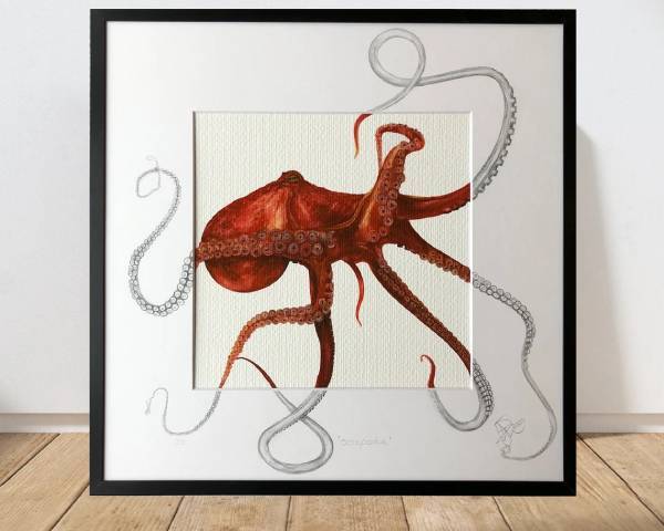
I first saw Samantha's work in a small café near Topsham, Devon. I love the way motion is captured by breaking the animals out of their frames. Plus, the combination of watercolour and line drawing is precisely my style, just executed well beyond what I could manage. I'd love to pick something up by them at some point, or even give a similar idea a go myself 😊
(If you love it too, Samantha's work can be purchased on Etsy)
The South Georgia museum
The fact that there is a fully-staffed museum on South Georgia makes me so incredibly happy 😊 This is an island without any permanent inhabitants (unless you count the penguins), no hotels, no eateries, no shops; in fact, there are barely any buildings at all. A few lodges and houses exist for researchers, there's a storehouse, a small chapel, the remnants of a whaling station and, of course, the museum.
The museum doesn't charge an entrance fee and the staff's commute to the island for the summer season (the only time of year that South Georgia is occasionally accessible to the cruise liners that stop by) can take months, relying on borrowed passage onboard coastguard patrol vessels, fishing boats, and the local navy. Once on the island, there's no real chance to leave, very little contact with the outside world, and a general feeling of just having to get stuck into whatever island life throws at you.
Unsurprisingly, jobs at the museum are targeted at those who are "happy with intense solitude" and "are able to wear whatever hat is needed for the day". Possible tasks include graveyard maintenance, petrol tank pumping, aiding scientific research, and, of course, manning the gift shop. Because even at the end of the world, a museum isn't truly a museum without a gift shop.
It's utterly mad and completely wonderful. I desperately want to visit!
Laziness does not exist | Devon Price
I have read this article half a dozen times since I first discovered it a couple of months ago. Each time, it angers me, saddens me, and reminds me that people are inherently, well, just people. That's all. Devon has written a beautifully empathetic treatise targeted at educators, but applicable to anyone and everyone.
If a person’s behavior doesn’t make sense to you, it is because you are missing a part of their context. It’s that simple.
On the idiocy of grandstanding over those without a home:
Kim is the person who taught me that judging a homeless person for wanting to buy alcohol or cigarettes is utter folly. When you’re homeless, the nights are cold, the world is unfriendly, and everything is painfully uncomfortable... In that chronically uncomfortable, over-stimulating context, needing a drink or some cigarettes makes fucking sense. As Kim explained to me, if you’re laying out in the freezing cold, drinking some alcohol may be the only way to warm up and get to sleep. If you’re under-nourished, a few smokes may be the only thing that kills the hunger pangs. And if you’re dealing with all this while also fighting an addiction, then yes, sometimes you just need to score whatever will make the withdrawal symptoms go away, so you can survive.
On procrastination being misunderstood:
In fact, procrastination is more likely when the task is meaningful and the individual cares about doing it well.
On why the concept of "laziness" is almost always incorrect:
People do not choose to fail or disappoint. No one wants to feel incapable, apathetic, or ineffective. If you look at a person’s action (or inaction) and see only laziness, you are missing key details. There is always an explanation. There are always barriers. Just because you can’t see them, or don’t view them as legitimate, doesn’t mean they’re not there. Look harder.
Wombo art | Dream
Generate your own surreal landscapes and posters. Pick a style, give the algorithm a prompt, and just let it create something bizarre or wonderful. A great way to quickly iterate some ideas for concept design. I've even seen people in the Planet Zoo community use it for inspiration.
Debunking the alt text character limit | Eric Eggert
I've basically ignored this "rule" for years because I've never been able to replicate it myself. I test with a handful of screen readers, and none of them have ever cut alternative text short, but I still see the old "125 character limit" knocking about. It's nice to know that someone has taken the time to properly test this, and has firmly debunked it. Maybe, at some point, alt text had a limit; maybe it's just a misunderstanding about how JAWS splits large text chunks up. Either way, a better rule of thumb is: keep alt text concise, but don't worry about length so long as what you're writing is meaningful 😉
No screen reader cut off text altogether. JAWS – and I have tested this with a more recent version of it as well – will split up the alternative text into multiple graphics with shorter alternative text.
GSAP video export | Chris Johnson
A handy little tool for exporting GreenSock animations as videos, with a wealth of customisation options. Perfect for sharing animation work on social media or dropping examples into case studies 👏