Some clever Lightroom techniques I've not seen before. Particularly like the use of gradient masks to accentuate existing light sources, and the "sandwich" technique is also very clever. Both work best now that Lightroom has such powerful automasking.
I always enjoy hearing others' thoughts on taxonomies, and Lea's ideas are well thought through and come with some interesting challenges (and findings) around using hackable URLs, folksonomies, and static site generators like Eleventy. All useful stuff!
On the issues of orphan tags (only used in one place):
It is important to note that orphan tags are not (always) an authoring mistake. While some tags are definitely too specific and thus unlikely to be used again, the vast majority of orphan tags are tags that could plausibly be used again, but it simply hasn’t happened.
And some UI ideas that Lea has been kicking around on how to handle them (including clustering them all in a disclosure pattern on their Tags page):
For now, I’ve refrained from making them links, and I’m displaying them faded out to communicate this.
Another alternative I’m contemplating is to hide them entirely. Not as a punitive measure because they have failed at their one purpose in life 😅, but because this would allow me to use tags liberally, and only what sticks would be displayed to the end user.
On the problem of considering tags to be a folksonomy, and therefore lacking hierarchy (i.e. a flat structure of labels):
I have yet to see a use case for tagging that does not result in implicit hierarchies.
And their conclusion around categories, which runs counter to my own, but makes a lot sense, given their context:
Lots to think about, but one thing seems clear: Categories do not have a clear purpose, and thus I’m doing away with them. For now, I have converted all past categories to tags, so that the additional metadata is not lost, and I will revisit how to best expose this metadata in the future.
A lovely overview of much of the new CSS that has landed (or is landing) in browsers recently, and how that relates to component-led architecture:
Thoughtful usage of container queries, :has(), and other modern CSS features makes your components and layouts for more resilient across unknown conditions.
On CSS resets:
Scope "default" styles using the :not selector e.g.
Also love the use of max() here to prevent the size dipping below a single pixel, and em units to scale with text size.
Useful to set global padding on the :target and :focus selectors, so that any anchor links used to jump around a page will leave some gap above and below them (e.g. sticky headers):
Using outline is preferable and lets us use things like outline-offset for easy styling.
On when we can start using CSS native nesting:
Use tools like Lightning CSS to let you use native nesting today, and that will monitor browser coverage and convert your styles as needed.
On cascade layers:
Layer priority works similarly to styles: those that come last override those before them (so top-to-bottom in a stylesheet is lowest-to-highest priority).
Un-layered styles take top priority.
That default ordering can be overridden using a layer definition rule at the top of a stylesheet (the example given is what Steph is using):
@layer reset, theme, global, layout, components, utilities, states
Annoyingly, it seems that nesting layers works inversely, so the if you have a layer nested within another layer, the child layer will have lower priority than the parent. That feels counterintuitive to me, where I'd expect nested styles to be more specific and therefore higher priority. Will have to wait and see 😬
Users with forced colour mode enabled will often lose additional borders or outlines on non-interactive elements, so if you are ever disabling a browser style using outline, it is best to leave it in place and instead set the colour to transparent. Force colour mode will convert this to a visible outline:
a:focus-visible {
    outline-color: transparent;
}
On using :has as a quantity query:
Example given is a pagination component, where each page is listed as a link (e.g. 1, 2, 3, 4 etc.). But if you have 100+ pages, you probably don't want all of those links. We can use :has and :nth-child (or other pseudo-selectors) to query the number of specific children within a component, and then apply styles:
.pagination:has(li:nth-child(11)) { // 11 here means that after 10 pages, apply the following
    ... // hide some of your pages, or revert to an Page x of y style labelling instead
}
If you combine this with containers and style queries, you can get some very clever logic directly in the CSS. For example, if you have a navigation menu that you want to show a dropdown on smaller screens and if there are more than 6 menu items only show them if there is enough space, you could do this:
The issue with the above is that localisation may cause your words to change length and therefore the fixed container sizes could be altered but I think we're also getting the ability to use custom properties in container query statements, so that could mean a very small amount of JS would be able to cascade across an entire site 🤯
A brilliant deep-dive into the subtle psychological manipulation that occurs when interacting with LLMs and other so-called "AI" tools and the parallels inherent with con-artist tricks such as mindreading, mentalism, cold reading, etc. I've yet to find a piece that so adequately sums up my own feelings about that space, and puts into words ideas I've struggled with. I actually shouted "YES!" out loud, to myself, several times whilst reading this 😂
On the commonalities between ascribing intelligence to LLMs and supernatural powers to psychics:
The intelligence illusion seems to be based on the same mechanism as that of a psychic’s con, often called cold reading. It looks like an accidental automation of the same basic tactic.
The chatbot gives the impression of an intelligence that is specifically engaging with you and your work, but that impression is nothing more than a statistical trick.
All of these are proposed applications of “AI” systems, but they are also all common psychic scams. Mind reading, police assistance, faith healing, prophecy, and even psychic employee vetting are all right out of the mentalist playbook.
On why so many in the tech industry appear to have fallen for the belief in proto-AGI so completely, and how certain behaviours within AI enthusiasts inadvertently turn them into the exact "marks" that psychics, mentalists, and other con-artists actively try to locate:
Those who are genuine enthusiasts about AGI—that this field is about to invent a new kind of mind—are likely to be substantially more enthusiastic about using these chatbots than the rest.
“It’s early days” means that when the statistically generic nature of the response is spotted, it’s easily dismissed as an “error”.
Anthropomorphising concepts such as using “hallucination” as a term help dismiss the fact that statistical responses are completely disconnected from meaning and facts.
On how LLMs and psychics are similar:
They are primed to see the chatbot as a person that is reading their texts and thoughtfully responding to them. But that isn’t how language models work. LLMs model the distribution of words and phrases in a language as tokens. Their responses are nothing more than a statistically likely continuation of the prompt.
Already, this is working along the same fundamental principle as the psychic’s con: the LLM isn’t “reading” your text any more than the psychic is reading your mind. They are giving you statistically plausible responses based on what you say.
On how we got here, likely not through intent, but more through one field (computer science) not really paying attention to the warnings from other fields (psychologists, sociologists, etc.):
In trying to make the LLM sound more human, more confident, and more engaging, but without being able to edit specific details in its output, AI researchers seem to have created a mechanical mentalist.
The field of AI research has a reputation for disregarding the value of other fields, so I’m certain that this reimplementation of a psychic’s con is entirely accidental. It’s likely that, being unaware of much of the research in psychology on cognitive biases or how a psychic’s con works, they stumbled into a mechanism and made chatbots that fooled many of the chatbot makers themselves.
On the power of "subjective validation", something which seems to affect everyone, and particularly impacts those who believe themselves to be "smart":
Remember, the effect becomes more powerful when the mark is both intelligent and wants to believe. Subjective validation is based on how our minds work, in general, and is unaffected by your reported IQ.
On the concerns with how we're currently talking about, thinking about, and potentially using LLMs and similar models:
Delegating your decision-making, ranking, assessment, strategising, analysis, or any other form of reasoning to a chatbot becomes the functional equivalent to phoning a psychic for advice.
I’ve come to the conclusion that a language model is almost always the wrong tool for the job.
An interesting read into designing UIs for LLMs and other generative ML algorithms, particularly given the author's relatively extensive work in that field. The main takeaway seems to be that pure "chatbot" interfaces are rarely good UX, but augmenting with various input options can be a quick way to refine them.
On the core issue of "textbox input" as your interface:
Good tools make it clear how they should be used. And more importantly, how they should not be used. [...] Compare that to looking at a typical chat interface. The only clue we receive is that we should type characters into the textbox. The interface looks the same as a Google search box, a login form, and a credit card field.
On the ways people work and how chatbots break "flow state" entirely:
When a painter is working, there are two distinct actions: up close, smooshing paint around on the canvas and stepping back to evaluate and plan. These two modes (implementing and evaluating) are present in any craft: programming, writing, you name it. Good tools let the user choose when to switch between implementation and evaluation.
On the key argument around augmenting chatbot interfaces or envisioning entirely new forms:
Hopefully I've convinced you that chatbots are a terrible interface for LLMs. Or, at the very least, that we can add controls, information, and affordances to our chatbot interfaces to make them more usable.
One of the most thorough explorations of an About page I've ever seen, and packed with interesting, thoughtful ideas, such as the statuses as a pseudo "now page" and red/green/grey colour icons to suggest whether they're open for work etc. From the interface to the personality, this has made me want to explore similar themes myself. Very cool!
On why they've used multiple chat-style "users" to their about page:
Even in informal contexts, I communicate differently depending on the audience... Anyway, my point is—the language I use is always context-dependent, and writing an about page that satisfies all those contexts is hard.
On the UI design:
The messaging app concept is based on Discord and Slack. The idea is that each persona is a different contact in the message list. They have their own statuses and names and writing style.
On the clever use of a stealth "contact" page and very nice touch around pronouns:
Since anhbot is a bot and not a version of myself, it talks about me in third-person. This is also nice because then I can slide in some pronouns.
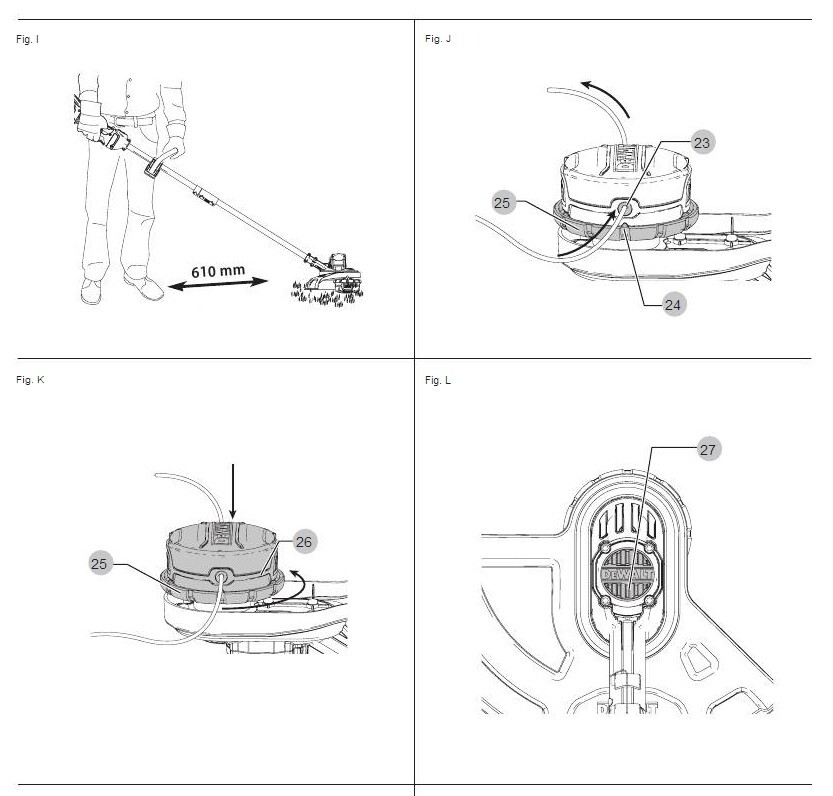
It's a bit ridiculous, but I keep losing access to the manual for our strimmer, and the instructions aren't that clear even when I do find it again. Plus, to make matters worse, there are several videos online but they all subtly disagree and I've not found one that works perfectly. Having just managed it (first try and all!) I thought it was worth recording what I did:
Turn the strimmer off and remove the battery;
Cut a length of strimming line (max. 8m; 5m seems to work pretty well);
Quick aside: strimming line to use is the DeWalt 2mm thick "guaranteed tough" yellow and black range.
Flip the strimmer over so that you're looking at the cutting side;
Align the spool housing (the black, circular, DeWalt branded rotating block on the underneath of the strimmer head) so that the holes match the plastic arrows pointing up from the base of the head;
Thread the new cutting line through one hole and out the other side (doesn't matter which hole). Keep pulling through until there are equal lengths sticking out of each hole;
Tip: this can be tricky, particularly with very curvy line that has been kept spooled up, so you can remove the cap by pushing the clips in on either side and popping it off. That will let you see the path the lines has to take, and poke it through with a stick or your finger.
Place the cap back onto the spool housing (if removed) and place one hand onto it, covering the DeWalt logo, to hold it in place;
Rotate the ring at the base of the spool housing (#25 on Figure K) anti-clockwise to wind the line in;
This is anti-clockwise when facing the spool head. So it should go anti-clockwise around the DeWalt logo on the cap. The mechanism will likely "click" with each rotation.
See the images below (Figure K specifically).
Keep going until about 12cm of line is left on either side. If one is longer than the other, cut it to make them match.
That should do it. If you power the strimmer on the line should whip round a few times and then settle. It may get caught under the spool head once or twice; if it does, you can wind a bit more in and try again. If it completely unravels, then there's either not enough line overall, or it was wound in the wrong direction.
Not the most helpful diagrams, but these are from the official manual and about as useful as that gets.
A very thorough overview of how to write a modern, performant, HTML-driven image component that is as optimised to serve the most appropriate image as possible. There are some very neat tricks in here, though I'll caveat it all with: the article openly admits that the native <picture> element does everything you would want, but then goes into great detail about an alternative, slightly hacky (albeit clever) workaround using the <img> element. I can understand where the author is coming from as to their reasoning for the second option, but it does seem that the final conclusion should be to use the <picture> element in almost all circumstances.
Yes, you avoid an extra element in the DOM using the <img> technique, but the <picture> element is intended for this behaviour, which means browsers will actively test for it to work (unlike unofficial <img> hacks) and any extensions to HTML will likely focus on supporting <picture> first. You can also look up what your code is doing on MDN or any other developer resource using <picture>, rather than a single blog article. In other words: short-term engineering gains and DX may lead to long-term technical debt, which feels overlooked.
On the current state of image optimisation on the web:
The HTTPArchive found at least 70% of all websites have an image as the most prominent element, yet only 34% of the web uses <img srcset> to create responsive & performant images (and even fewer use <picture>).
On the minimum feature set of a modern, responsive image component:
This brings us to the following checklist:
☑️️ Serve different dimensions based on the viewport size (e.g. different images for desktop and mobile)
☑️️ Serve different qualities based on the viewport size
☑️️ Serve different qualities based on Device-Pixel-Ratio (DPR) / zoom level
☑️️ Optional: Deliver different file formats (WebP, AVIF, …)
Example of how to use a <picture> element to achieve the above:
<picture>
  <source
    // `media` contains a CSS media query (MQ) that is used to control which
    // specific source to render (first true `<source>` wins)
    media="(-webkit-min-device-pixel-ratio: 1.5)"

    // `srcset` contains the path to an image and an 'intrinsic width descriptor',
    // corresponding to the original image width on your device
    srcset="2x-800.jpg 800w, 2x-1200.jpg 1200w, 2x-1598.jpg 1598w"

    // `sizes` consists of a CSS MQ condition and the width of the slot
    // You can also use a viewport width (`vw`)
    sizes="
      (min-width: 1066px) 743px,
      (min-width: 800px) calc(75vw-57px),
      100vw">
  <img src="1x.jpg" alt="">
</picture>
In this example, for old browsers and below 1.5x DPR screens, the 1x.jpg image is loaded. For other screens, browsers differentiate based on the viewport width, so modern phones load 2x-800.jpg, desktops 2x-1598.jpg.
Example of the <img> element replicating the native functionality of <picture>, written in an automatable way; here N, M, and A are used to mean the image widths and the minimum "mobile/desktop" breakpoint (A):
<img
  sizes="
    (max-width: Apx) and (resolution: 1dppx) Npx,
    (min-width: (A+1)px) and (resolution: 1dppx) Mpx,
    (max-width: Apx) and (min-resolution: 2dppx) (M+1)px,
    (min-width: (A+1)px) and (min-resolution: 2dppx) (((M+1)*5)+1)px"
  srcset="
    low-dpr-xs.jpg Nw,
    low-dpr-xl.jpg Mw,
    high-dpr-xs.jpg ((M+1)*5)w,
    high-dpr-xl.jpg (((M+1)*5)+1)w"
  src="fallback.jpg"
  alt="don't forget the alt attribute"
/>
On how the above works:
By combining sizes and srcset (width descriptors), we get back the control of what browsers do. As mentioned earlier, the width descriptors work implicitly, so we introduce a specially crafted sizes attribute that targets individual DPRs to help us make it explicit again. Our crafted <img> tag now behaves like a <picture> tag, with no additional tags required. We can conditionally load high quality images in different dimensions and different qualities.
On some research into how low fidelity you can go before people notice/complain:
...we’ve tested how different JPEG image qualities are perceived and found no perceiptable difference betweeen 50% and 35% quality for smartphones with 2x DPR screens. Same for 1x screens in general, where 75% works fine for us.
A very useful explanation of how to interpret the test results from CrystalDiskMark, as well as a solid overview of how to tweak the settings to really understand and analyse your drives.
A fantastic series of short, introductory videos put together by the folks over at Tetralogical. Each one provides an insight into how assistive technologies and alternative browsing methods are actually used, from screenreaders (on both desktop and mobile operating systems) to magnification to voice control.
Even with extensive experience using and testing with some of these tools, I still found several things here impressive and/or interesting:
It will never get old hearing a screenreader running at 100% speed; so impressive that people are able to parse information out of that!
Excellent demonstration of both screenreader hotkeys (e.g. using H for heading navigation) and voice-controlled "mouse grids"
Tips on how to enable keyboard navigation in macOS
I've been digging into tabbed interfaces ("tabs") recently. As usual, Heydon's Inclusive Components has one of the best overviews and write-ups of the techniques used. I particularly love how Heydon breaks down ideas into logical progressive enhancement flows; in this case, that means thinking about a set of tabs as a linked table of contents followed by "sections" of content:
For my money, an embryonic tabbed interface is just a table of content with same-page links pointing at different sections of the page.
That allows a good baseline on which we can build a more "expected" visual interface for the tabs with CSS, and augment the functionality with JavaScript. The end result can be seen in this CodePen:
I have also cross-referenced with Adrian Roselli's older post (which now links to Heydon's early work on this subject) and see that the two are broadly similar: ARIA Tabs
The main takeaway here is that you should use a list of links as the tab controls, followed by a number of content sections. These are then bound together using a combination of ARIA roles, ARIA labels, and other assistive/semantic attributes (note that the inclusion of aria-controls is not consistent across implementations and should be tested):
On using CSS to visually hide content, even without needing a visually "tabbed" interface:
What if I used some CSS to make just the chosen section from my table of contents visible? This is certainly possible using the :target pseudo-class.
section:not(:target) { display: none; }
On how a basic table of contents may be the better approach:
I have encountered innumerable JavaScript-driven and ARIA-adorned, fully-fledged tabbed interfaces where simple tables of content atop page sections would have done just as well. Better even, since they are more robust and efficient. But for goodness' sake make them look like tables of content. Meet the expectations you set in visual design with your semantics and behaviors.
On why you shouldn't allow the tabs to be "tabbed" using the tab key, and that left/right arrow keys are a better alternative:
This problem is solved by delegating tab selection to arrow keys. The user is able to select and activate tabs using the arrow keys, while the Tab key is preserved for focusing contents within and below the active tab panel. To put it another way: Tab is not for tabs, which I concede is a bit confusing.
It's equally important that pressing Shift + Tab returns the user to the selected tab.
On ensuring non-visual users aren't forgotten. If we're altering tab order for keyboard users to be able to go from a tab selection directly to the content of that tab, then we should do the same for non-visual users as well by ensuring the common use of the down arrow is handled correctly:
Instead, we can intercept the down arrow key press and move focus programmatically to the open panel itself, making sure it isn't missed.
Although sighted keyboard users are less likely to use the down arrow key, it's important the focused tab panel has a focus style to indicate a change of focus location.
On dealing with tabbed interfaces on narrow viewports (responsive design):
A tabbed interface needs a breakpoint where there is insufficient room to lay out all the tabs horizontally. The quickest way to deal with this is to reconfigure the content into a single column.
On why switching to an accordion is probably not the best idea (though I'd argue that completely swapping out one component for another here would be a logical solution, and could provide a better UX, so long as it's well tested to ensure that the way the component is used is similar for all navigation methods):
Some have made noble attempts to reconfigure tabbed interfaces into accordion interfaces for small viewports. Given that accordions are structured, attributed, and operated completely differently to tabs, I would recommend against this.
Google have recently announced a change to their Core Web Vitals metrics. The existing FID stat is being sunset, and replaced with a new way of measuring responsiveness: Interaction to Next Paint, or INP. Overall, it seems like a solid upgrade, with a better focus on real-world experiences (though I'd be lying if I said I fully understood the complex analysis being done to derive the final value).
Looking over the optimisations guide, there are definitely going to be some interesting new use cases for some of the performance-related additions to CSS and HTML, such as content-visibility, but the big hits look like they're going to come to some of my "favourite" negative trends of modern web dev (insert maniacal grin emoji here):
Large DOMs will be hit, which means there's now hopefully a strong(er) incentive to use semantic elements and avoid <div>-itis (and, by extension, UI frameworks that utilise dozens of wrapping elements or verbose class-name-to-element transformations);
SPAs will be hit, with Google openly stating that there's not much that can be done here;
Interestingly, I'd predict hydration could be hit even worse, as part of the metric measures how often a user clicks on an interactive element that isn't yet interactive, which feels more likely where hydration is being used. Though good use of loading states may alleviate that;
Some of the other suggestions around minimising "layout thrashing" and using timeouts to postpone non-visual updates on event listeners are interesting, but a bit beyond my level of JS optimisations.