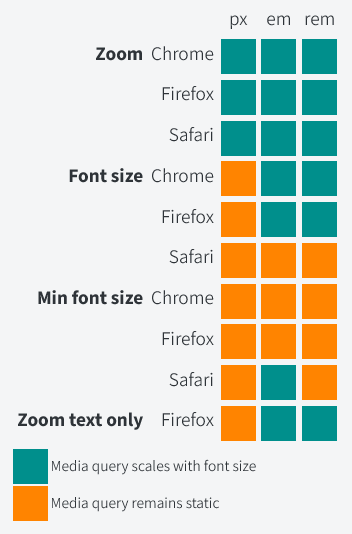
An overview of the state of media queries and accessible overrides (page zoom, text zoom, min/max font size settings etc.), seeking to determine which of em, rem, or px is the best option. Turns out that Safari is still doing things differently and still preventing their being a "winner", but pixels are your most consistent option, whilst em is likely the most broadly accessible (so really, no change).

On Safari still being the core issue:
I was disappointed to see Safari is still an outlier, where ems and rems don’t scale in media queries based on the user’s default font size.
On the reality of an inconsistent system (not sure I agree with this as a takeaway, but it does track with the data):
There is no clear-cut winner I can point to after looking at this. It probably depends on what you want to prioritize.
If you want consistency across all browsers, you should now use px in your media queries.
