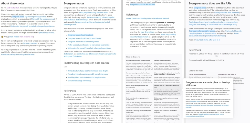
Andy has built a career considering the impact of note-taking and ways to maximise it as a way to gain deeper insights and develop general knowledge. This notes microsite is one of their related experiments: a fluid UI that maps out navigation through interlinked notes. It's clever, with some nice touches, but I do find it a little clunky. Still, plenty here to take note of, if you'll excuse the pun.
- Source
- Link to Original 🔗
- Published
- Categories
- Content Design,Web Design
- Tags
- zettelkästen,second brain,notes,link
Explore Other Notes
⬅ Newer
A modern CSS reset
Andy always has some interesting thoughts about CSS, and this reset is no exception. Lots of interesting things here that fit very nicely with both my own experience and other resets that I've […]
Older ➡
Note-taking apps don't make us smarter
A surface-level look at the world of note-taking apps, what the impact of "AI" may be, and why the much-lauded benefits of these tools never really seem to materialise. Ironically, I found the […]
- Andy has built a career considering the impact of note-taking and ways to maximise it as a way to gain deeper insights and develop general knowledge. This notes microsite is one of their related […]
- Murray Adcock